Nuvance Health
Redefining the expected in healthcare
A new era in healthcare
Driven by the desire to challenge industry assumptions, Western Connecticut Health Network and Health Quest of upstate New York came together to create a top-tier healthcare alternative. But in an industry where complexity rules and confusion has become standard, creating a differentiated brand in a highly competitive market, comprised of strong, established brands, was no small undertaking.
During our rebranding journey, we discovered that what makes this newly combined system so unique is the people and their shared mindset. Where some see impossible, they choose to see possible. They are continually striving to move forward, improving daily, making progress and pushing past the status quo in all aspects of what they do. It’s this mentality and genuine truth that inspired the new unified brand, Nuvance Health.
The decision to come together and become one health system gave Nuvance Health a tremendous opportunity to deliver a higher level of care and a better experience to their patients and communities. Together this new system is pushing past the expected, to create something unexpected. Something different and worthy of the people they serve. And in joining forces, they’re pushing the expected, working together to make the impossible possible.
For these two organizations coming together, Nuvance Health is a strong, ownable name that allows us to tell our story succinctly and boldly. Our next step is to courageously step into the unknown and continuously pursue what is possible.
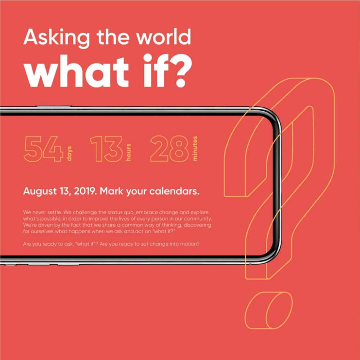
Pursue the new.
Always forward, always improving and making progress.
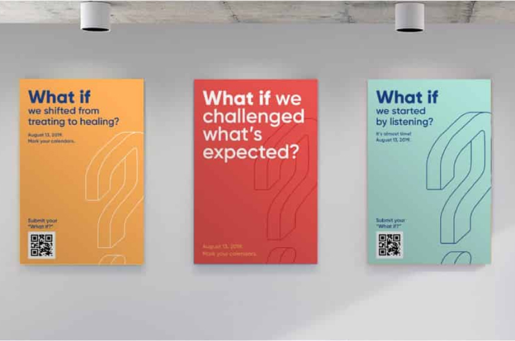
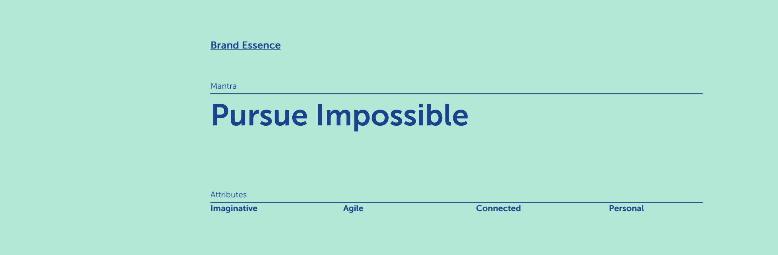
With its strong energetic sound, Nuvance speaks strongly to our mentality of continuous advancement forward. Relentlessly we push forward, into the unknown, pursuing the impossible by asking ourselves “what if?”
Advance forward.
Together we continuously pursue what is possible
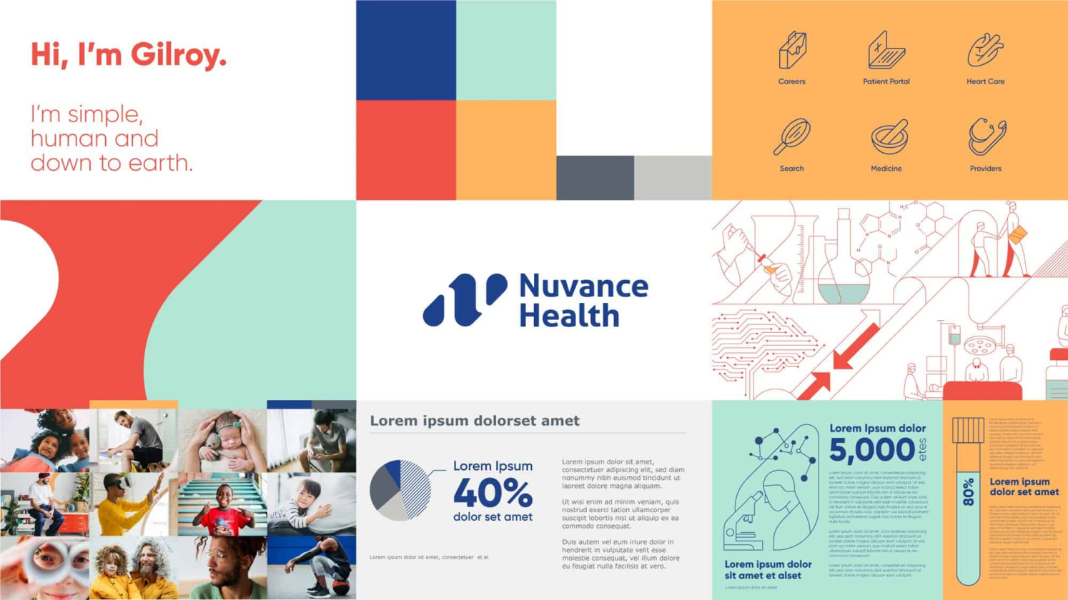
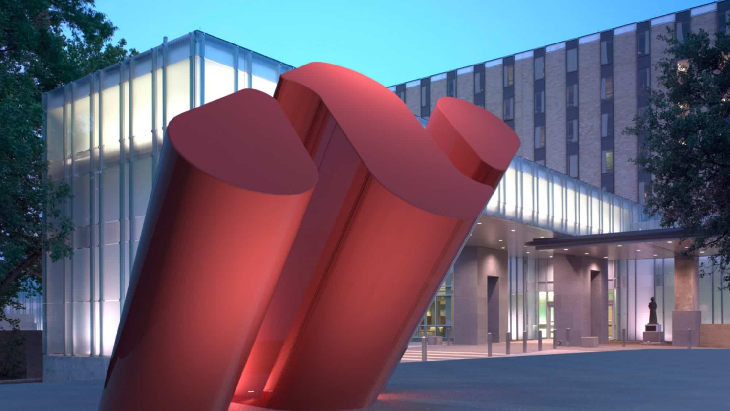
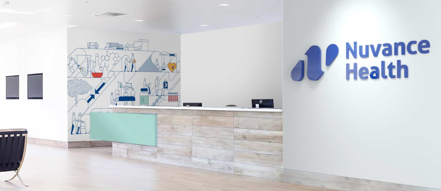
The Advancement Mark, set to the left of the Nuvance Health logotype, is the embodiment of the notion of pursuing the impossible. The always-pushing-forward stance that’s reaffirmed through subtle hints in the typography tells the story of never settling and the constant pushing of boundaries. The organic nature of the symbol is representative of our humanity and ability to shift perspectives, while the continuity of forms and the one-color treatment of the logo reinforce bold, simplicity and seamlessness.
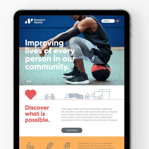
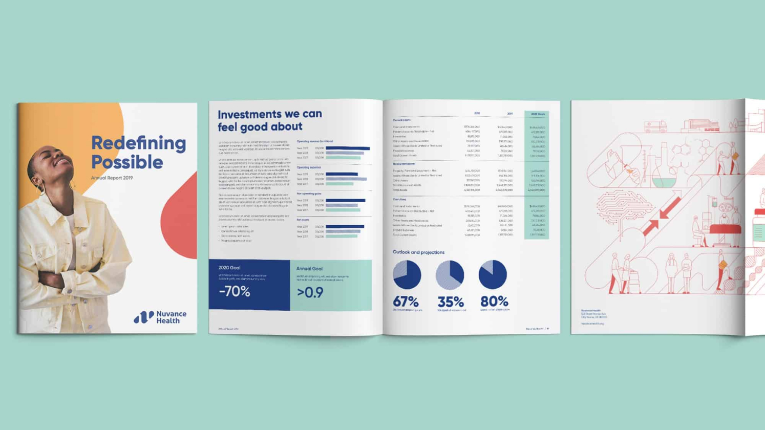
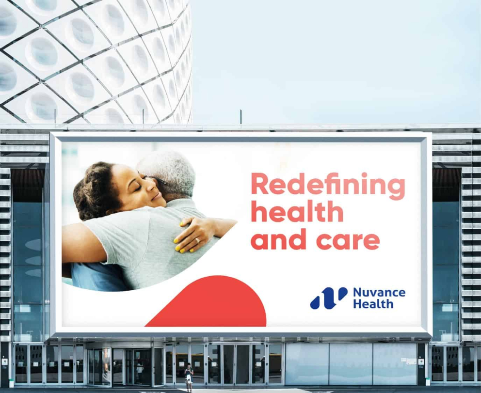
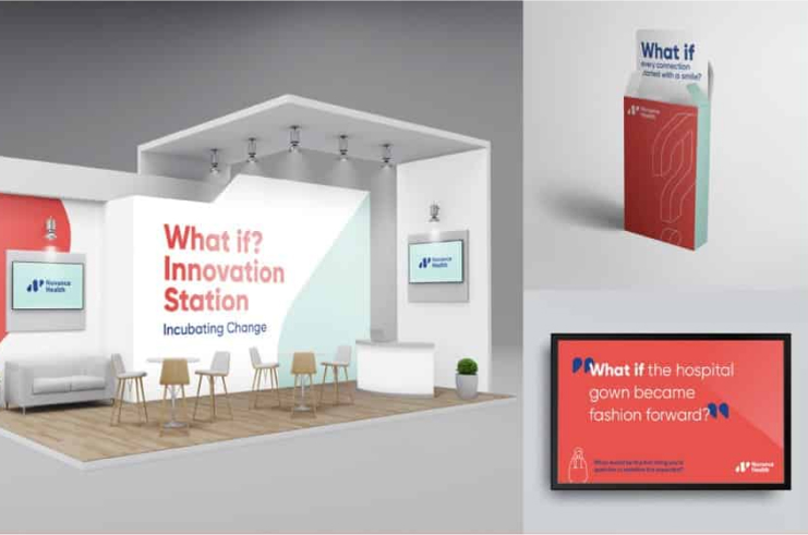
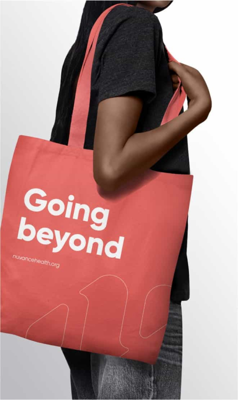
Leading with a bright and unexpected color palette that covers the full spectrum between humanity and science, the content is refreshingly straightforward and authentic, led by headlines that are bold and engaging.
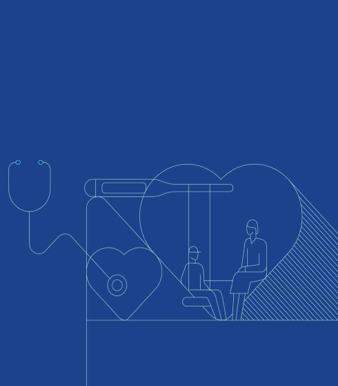
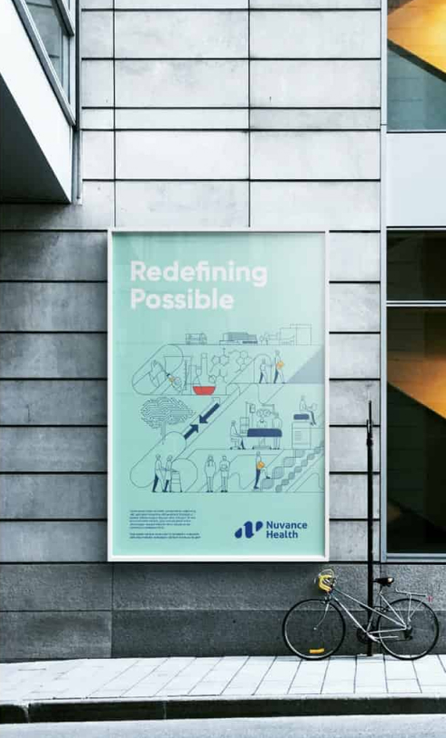
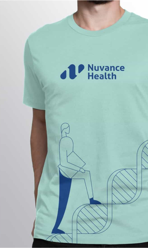
The world of Nuvance is brought to life through an illustration motif of scientific and human-centric moments that illustrate the work of Nuvance Health in an accessible way.
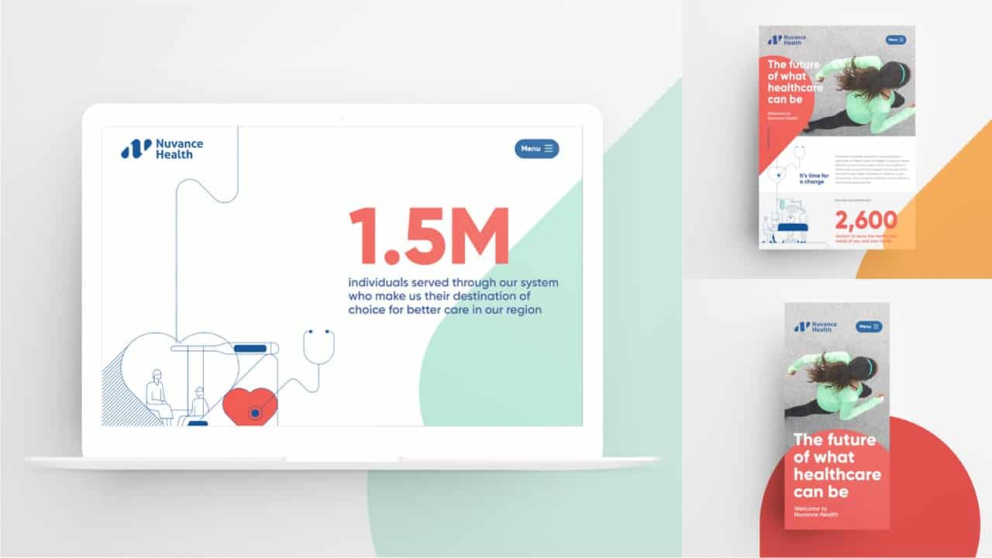
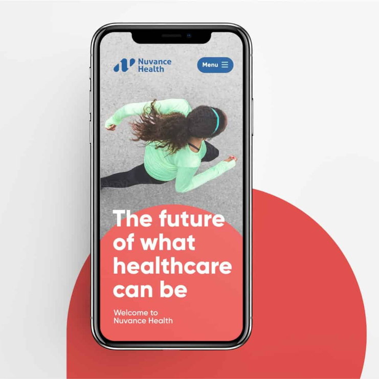
Powerful in its simplicity, this design system creates a sense of movement and progressive advancement. It tells a story of pushing boundaries and leads Nuvance Health boldly into the next era of health care.