Cella
Unifying three brands under one roof to put passion to work
By creatives, for creatives
The creative, marketing and digital space has undergone significant transformation, creating an opportunity for BLR Holdings, a leader in talent acquisition, to consolidate its multiple brands to tell a bigger, more cohesive story that reflects an already-moving culture. It’s guided by the belief that in-house creative talents in an organization are the heart and soul of that company, exuding a magnetism when creative is strategic and honest to the organization’s core. Our task was to create a brand that brought to life the idea behind this inner sanctum. And for Monigle, this brought a unique opportunity for our collective of creatives to create a brand that speaks to creatives.
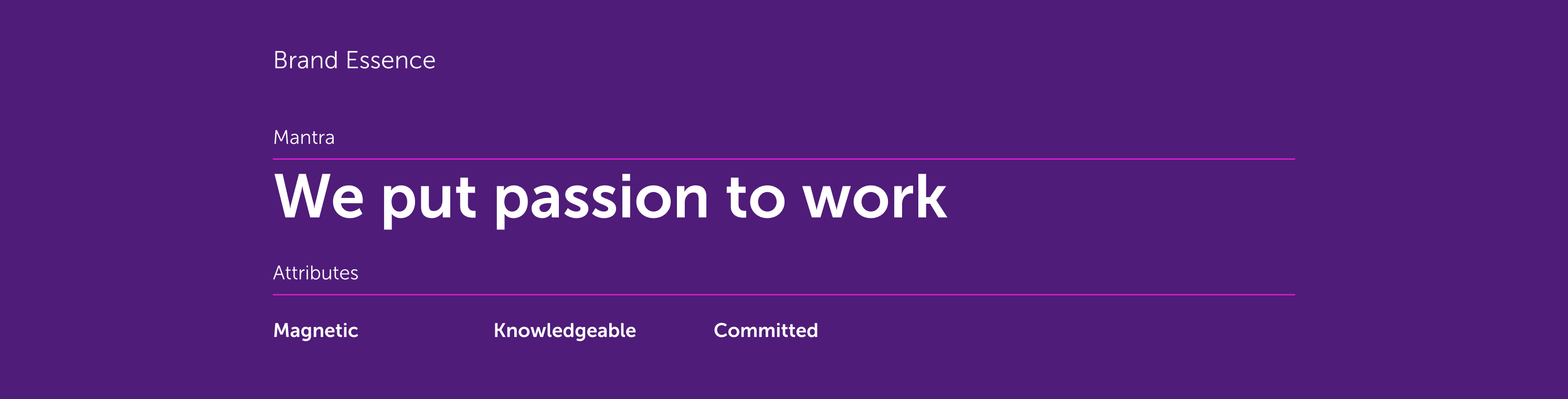
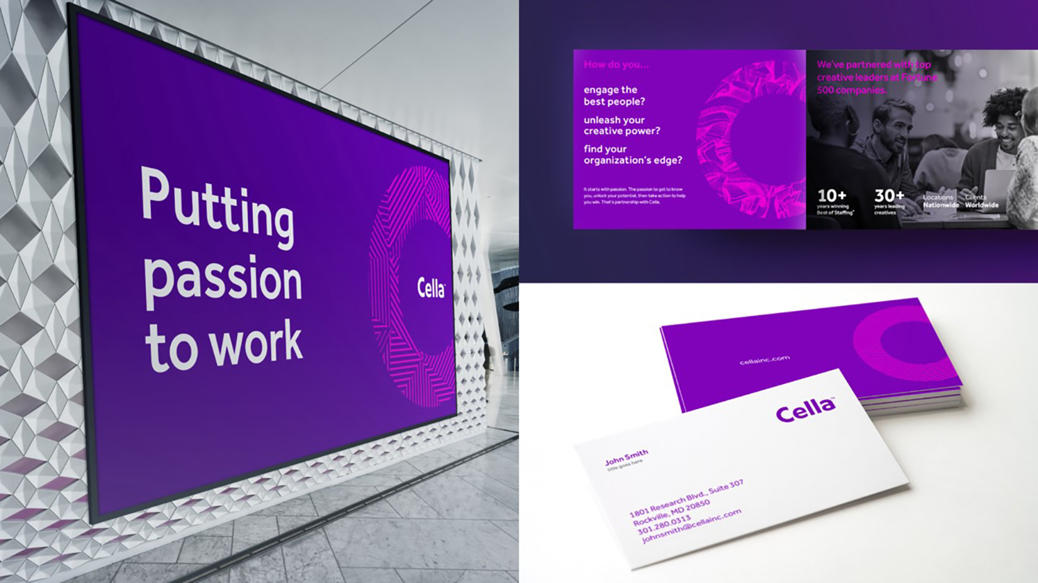
The reborn Cella brand speaks directly to its industry with a powerful, artistic aesthetic. Using the platform “We put passion to work” as a rallying cry that brings the company’s unique culture and spirit to the forefront, we created an experience that uses and implements art as the brand in the creative industry. The combination of the timeless, modern logo and design system with a fresh, conversational voice allow the new evolution of this company to stand out. The end result is one that elevated not only the client’s brand experience, but also what others expected out of the industry.
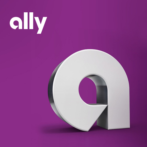
Cella’s logo is modern, approachable and uniquely them!
Initially, the typographic treatment feels familiar—but upon closer inspection, you can see that each letter has a subtle rounded quality that helps the logo look like it’s pronounced: seh-luh.
The name Cella is a Latin word meaning “innermost sanctum” or “inner core.” It’s a fitting name that reflects Cella’s belief that creative, digital and marketing teams live at the heart, or “core,” of an organization’s success.

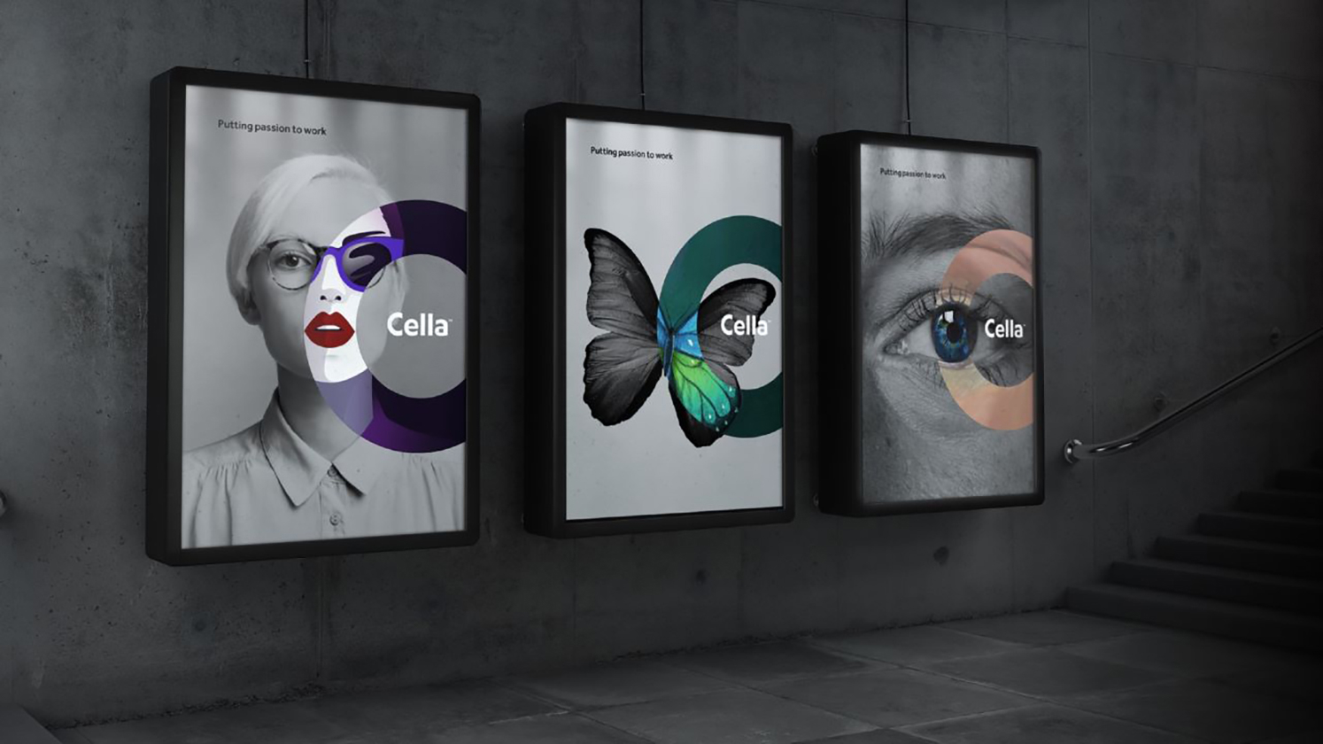
The visual identity captures Cella’s passion and expertise with a clean aesthetic and an eye-catching use of color. It flexes to speak to the brand’s different audiences while consistently expressing the spirit of the Cella brand.
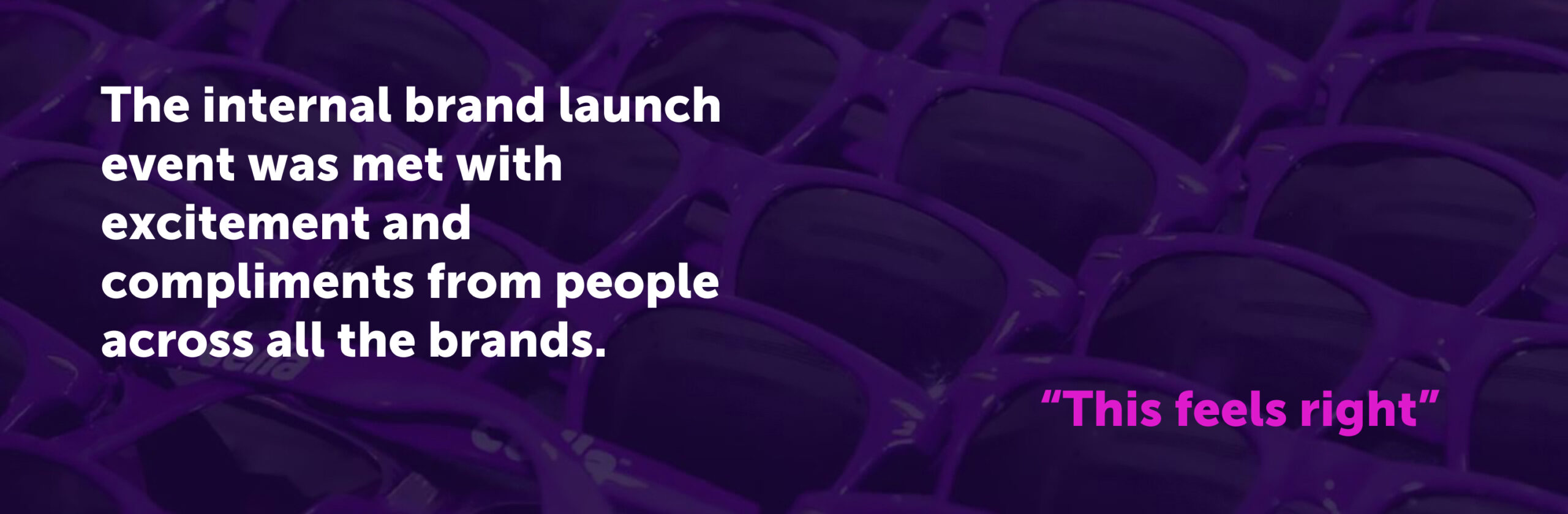
"We really couldn’t be happier with the overall branding process with Monigle. We wanted an agency with a battle-tested process that would minimize the drama and drive us towards a great result, and we wanted a team with high collective EQ that would help us get through the emotional landmines inherent in a process like this. On those two main points, I’d give the team perfect scores. Just as important, we completed the entire project on time and on budget."