Brand Consistency Doesn’t Have to Mean Inflexibility

We often hear “It’s all about brand consistency.” Initially what comes to mind is a homogeneous and regimented look and feel. Something similar to the image below of Southwest Airline’s branding, where the brochures match the business cards that match the pretzel packaging and so on and so forth.
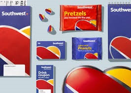
Southwest Airline’s new visually consistent branding
Of course, creating a visually consistent brand is important. It elevates the consumer experience because it communicates that every part of a brand is related and likely of similar quality. It also reinforces the brand across all touchpoints, increasing brand recognition.
However, creating a consistent brand is not limited to a visually cohesive design system. A consistent brand stays true to what it stands for and why it exists. And, being consistent doesn’t mean being inflexible. In fact, as long as your brand message and behaviors are consistent, the actual visual or verbal expression can vary in order to be more effective with different audiences across different channels.
There are several brands who effortlessly and effectively portray a consistent brand image with a flexible expression. Here are three:
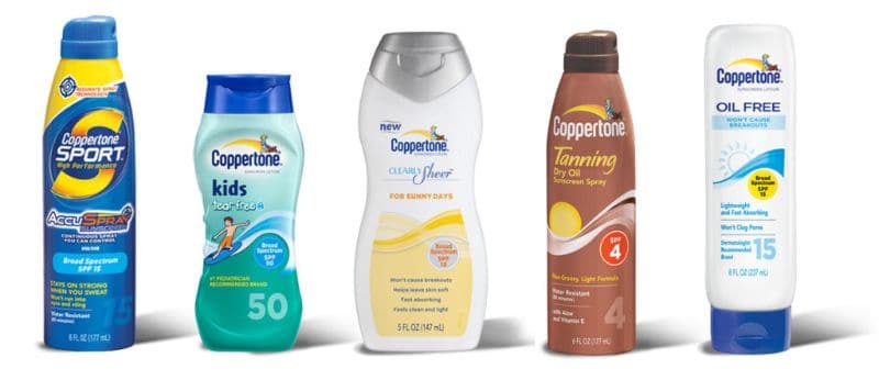
Coppertone’s brand is flexible across different product packaging
Coppertone’s brand flexibility stands out
Coppertone’s brand stands for protection; however, it has several different audience groups with varying needs. An athlete looking to protect his skin from the sun is concerned with how well the formula will resist sweat, whereas a mother looking for sunblock for her child is concerned with how well the formula will block rays while still being gentle on her baby’s skin.
Coppertone’s ability to be flexible with its product, packaging and advertising allows it to communicate clearly with each of its target audiences while staying true to its brand purpose.
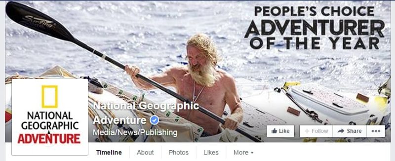
National Geographic’s Adventure website visually connects to its core audience
National Geographic inspires its audiences
National Geographic is another well-known brand that embraces flexibility within a framework. Appealing to audiences that range from adventurers to animal lovers, across multiple channels including print, digital, and television, the brand conveys a consistent image centered on inspiring people to care about the planet.
However, the expression of the brand image varies in order to effectively engage different segments of its business. Flexibility is demonstrated by using vibrant colors on the National Geographic Kids webpage, hardcore and adventurous imagery on the National Geographic Adventure Facebook Page, and heart-melting animal photos in Nat Geo Wild Ads, while consistently including the brand’s iconic yellow rectangle symbol.
Higher education leverages the power of a master brand
We often see colleges and universities apply a flexible branding approach because of the wide-ranging audiences they appeal to.
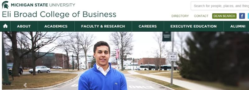
Michigan State’s master brand is evident in every application
Students seeking information about the School of Business differ from potential applicants to the College of Arts. Understanding how to flex the university master brand to create a range of audience connections can work to develop a stronger, more well-rounded brand.
Take my hometown college for example. Michigan State University makes consistent use of Spartan green while connecting imagery and copy more directly to its target audience.
Creating brand consistency doesn’t have to be equated with the overwhelming and expensive task of revising every touchpoint to match exactly. It’s about identifying what you stand for as an organization and how to best communicate that to your audiences.
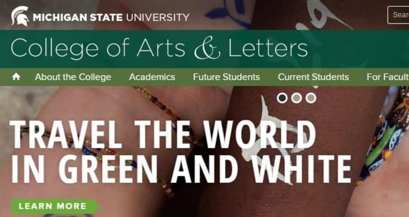
Spartan green evokes the Michigan State brand while the copy appeals to a specific audience.
Tracy Schrauben is a Strategy Consultant at Monigle.


