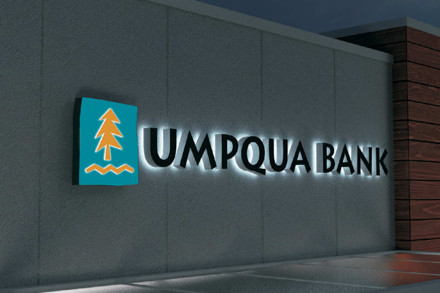
Umpqua Bank
The leader in customer experience implements a sign program to match.
From surviving to thriving
Like so many other banks, Spokane-based Sterling Savings Bank was hit hard during the 2008 financial collapse. Having survived, it dropped the dated “savings” part from its name and rebranded as Sterling Bank in 2012. With over $10.2 billion in total assets, it became the second-largest bank headquartered in Washington state.
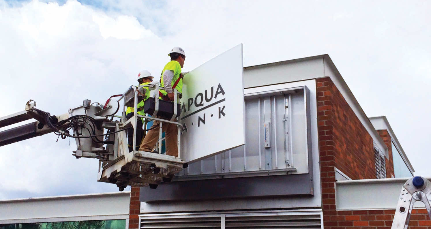
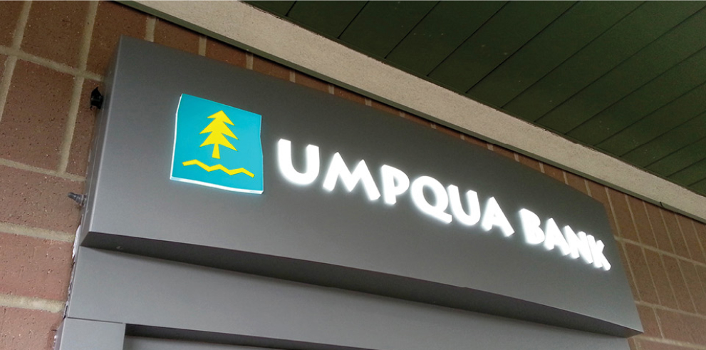
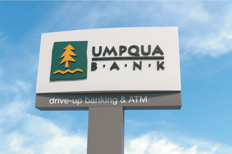
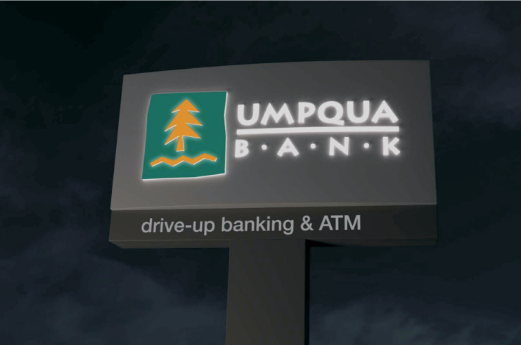
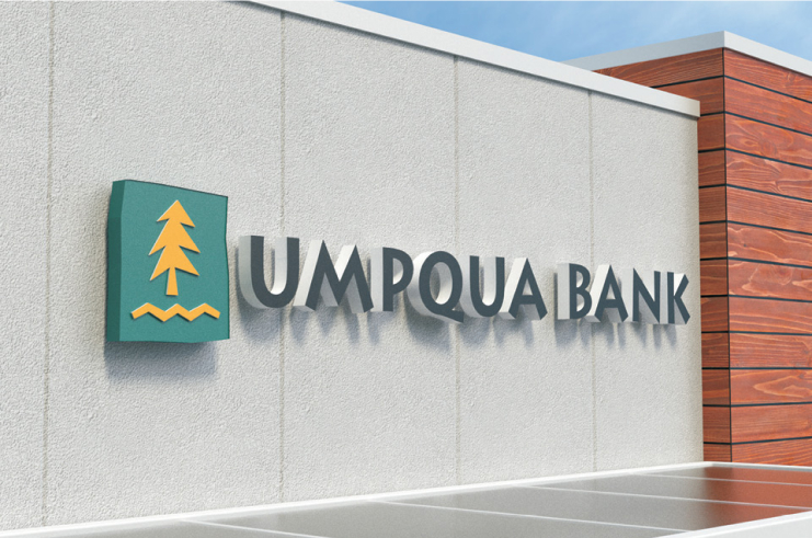
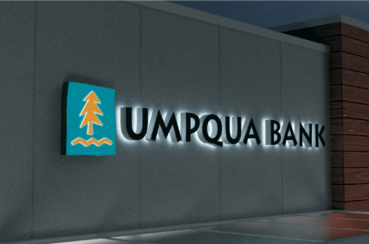
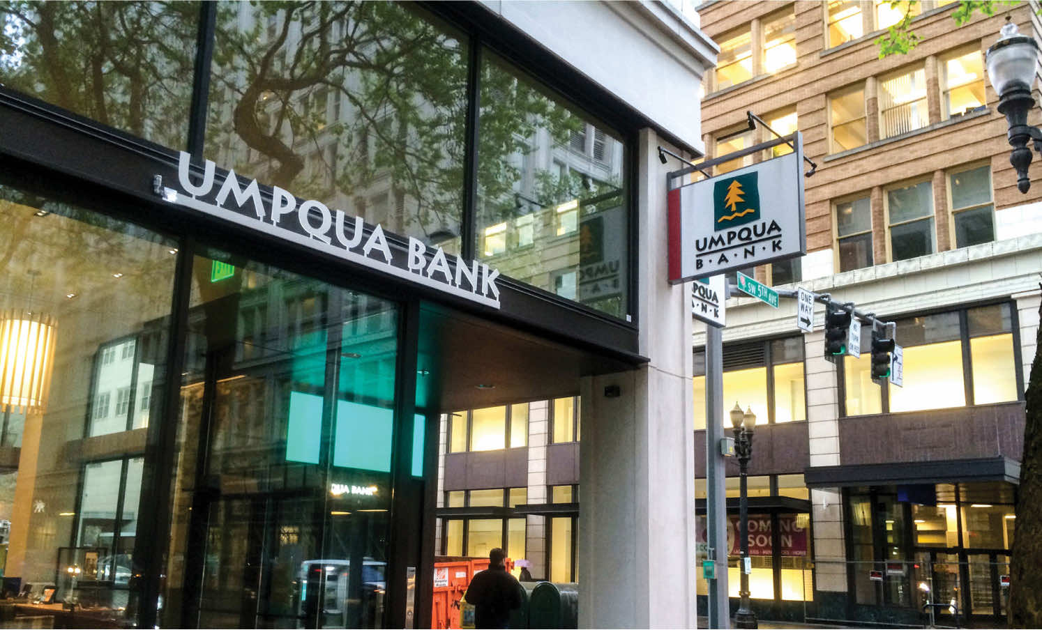
Armed with a new brand, Sterling needed to implement it—which meant rebranding thousands of signs across more than 200 branches in four states. Moreover, as the bank’s sign program was decades old, Sterling’s signage literally had to be brought into the 21st century. That meant increasing the volume and size of signs to maximize for code allowances, implementing more illuminated signs and replacing outdated lighting sources with more efficient long-life options—including LED modules in channel letter signs.
Sterling’s investment in its brand paid off. Following the conversion, the bank achieved a new level of viability and visibility—so much so that it caught the eye of another Pacific Northwest financial institution.
Capping the climb
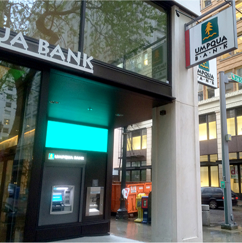
Less than two years after Sterling’s rebrand, Portland-based Umpqua acquired Sterling for $2 billion. The move resulted in the West Coast’s largest community bank, with 5,000 associates and nearly 400 “stores” (Umpqua parlance for branches) across five states: Oregon, Washington, Idaho, California and Nevada.
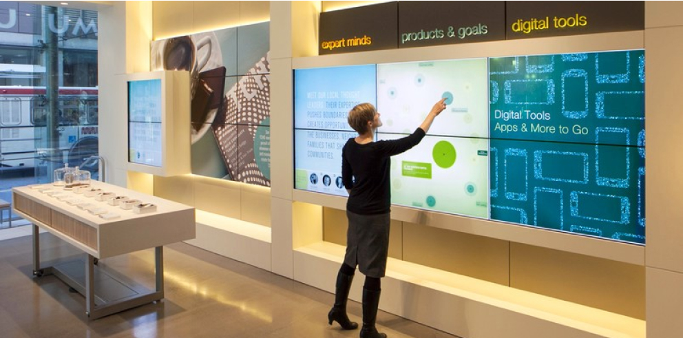
Under the leadership of visionary CEO Ray Davis, Umpqua had skyrocketed not only to a regional power but a national sensation. The bank’s innovative customer experience—including Pinterest-worthy interiors and activities like yoga classes and book clubs—captured the attention of the industry.
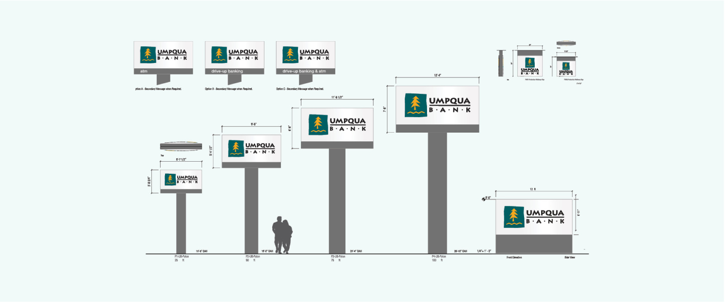
The Sterling acquisition capped a series of 21 acquisitions in 13 years. Because of the nature of Umpqua’s growth, there was no such thing as a typical store—they came in a plethora of shapes and sizes. As a result, Umpqua had never developed a standardized signage family and instead took a rather piecemeal, one-off approach to signs.
"With our size, shared cultures and financial strength, our combined organization is uniquely positioned to deliver value for our associates, customers, communities and shareholders."
Streamline and save
Measured by assets, Sterling was seven times the size of Umpqua’s next-largest acquisition; it also had a much larger footprint than its predecessors. Sterling’s acquisition more than doubled Umpqua’s existing stores and established a foothold in Idaho for the first time. If there was ever a time to implement a methodical, scalable signage strategy, it was now.
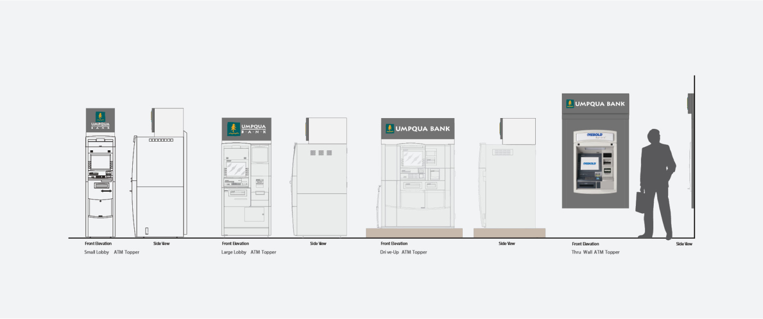
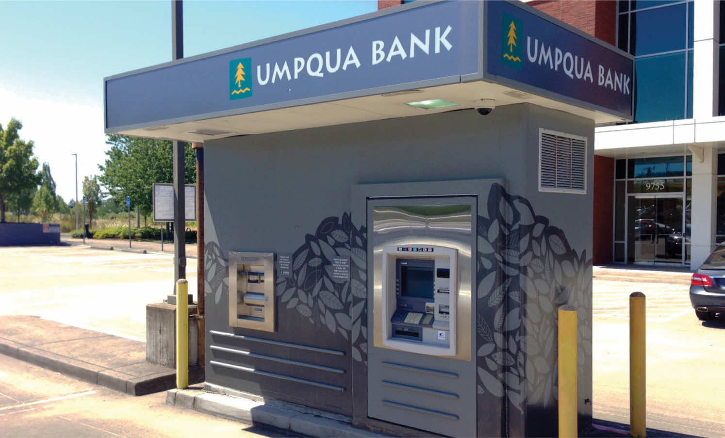
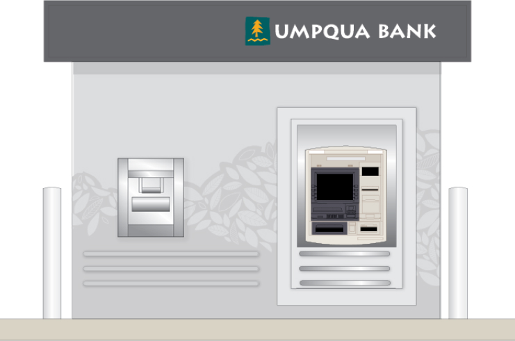
Since it had only been 24 months since Sterling had worked with Monigle to develop and execute an implementation strategy during its own brand conversion program, it made sense to follow the same course of action this time around. Of particular note during the first Sterling conversion was the transformation of its ATM program, which was pared down from about 50 different ATM designs to just eight. This contributed to a more consistent appearance across Sterling locations and unlocked cost savings due to the increased ability to build and buy in bulk.


Repeating a pattern for success
Umpqua was able to replicate Sterling’s efforts to unify the appearance of more than 200 distinct-looking buildings through a comprehensive sign system and save money while doing it. Because of the information we had thanks to the initial conversion—knowledge like code requirements, sign sizes, landlord contacts, etc.—Umpqua saved 25 percent on the entire project.
As Umpqua builds new stores, it continues to follow the signage standards and processes it used during the Sterling conversion. As a result, it’s in prime position to capitalize on the awareness-boosting powers a unified sign system can provide and further elevate perception among consumers and industry peers.
Umpqua was able to replicate Sterling’s efforts to unify the appearance of more than 200 distinct-looking buildings through a comprehensive sign system and save money while doing it.
$2 Billion price tag
Umpqua’s 2014 acquisition of Sterling boosted its total assets at the time to $22 billion.
#1 in Oregon
Portland-based Umpqua is the largest bank headquartered in the Beaver State.
#1 bank for customer experience
Drawing inspiration from the Ritz Carlton, Umpqua has received recognition by outlets like J.D. Power for its transformative customer experience.
25% savings
Umpqua shaved 25 percent off the standard cost of its Sterling conversion program thanks to its decision to enlist a signage partner that had guided another Sterling conversion less than two years earlier.