Northern Light Health
Making healthcare work for a changing organization—and world.
Outgrowing a name
After decades of growth and acquisition, Eastern Maine Healthcare Systems (EMHS) had outgrown its name. Having become a diverse network of providers extending across the state and with aspirations beyond it, EMHS needed to unify its network, without leaving regional identities and community connections on the table.
In parallel, EMHS had embarked on an ambitious business transformation that would touch every aspect of the customer experience internally and externally. Defining a new brand wasn’t just a nice-to-have, it was an imperative—a human manifestation of the change that was underway. The organization needed a brand to reflect the organization it was becoming and a brand bringing to life what it meant to be Maine proud.
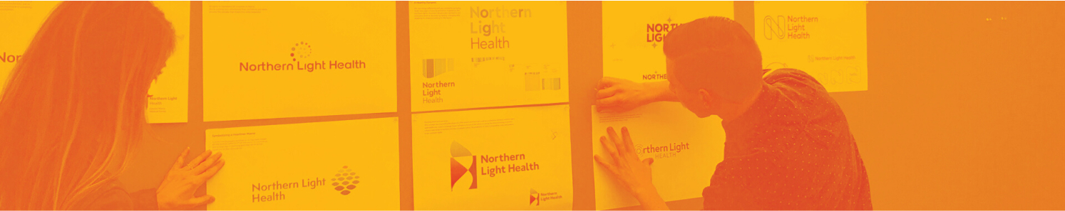
Crafting a brand as hardworking as a Mainer
From day one, it was imperative to get to know EMHS not just as an organization but also in its role as a close-knit member of a geographically diverse group of communities across the state. It started with qualitative research and ethnographic observations to establish the baseline. It included quantitative research with thousands of respondents focused on how healthcare decisions were made. But, it went much deeper…
It meant involving a cross-disciplinary group of physicians to determine every facility, service, location and practice name to ensure that our naming and brand architecture strategy would provide clarity for patients. It meant casting and narrating a brand video entirely from the perspective of staff, who get out of bed every day ready to make a difference. It meant diving into key moments of the customer journey to embed on-brand behaviors into everyday activities like rounding and appointment check-ins.

A beacon that inspires
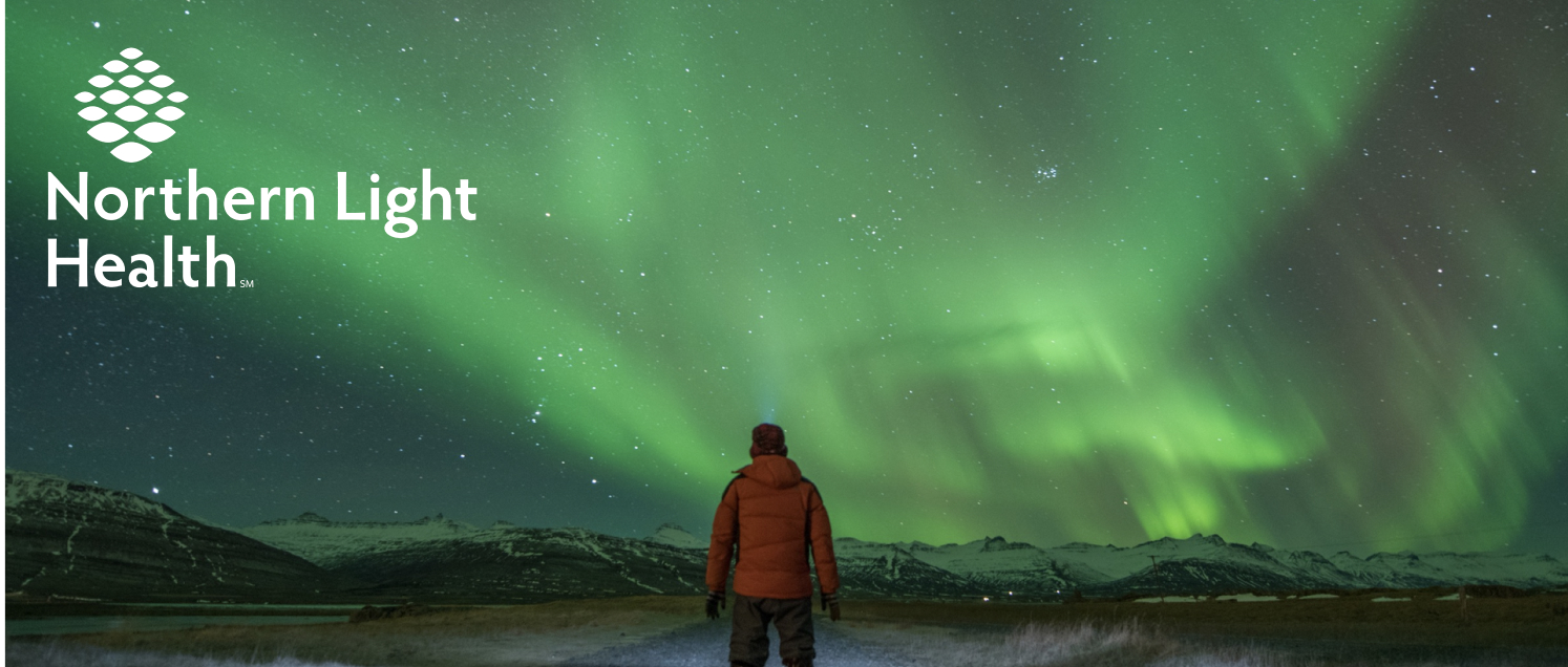
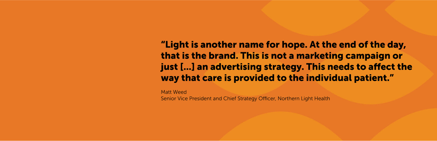
Among numerous considerations and following research to identify the strengths of high-merit, protectable name candidates, Northern Light Health emerged as the name to carry the organization forward. Beyond ties to the aurora borealis regularly seen in the region, Northern Light Health refers to the forward-looking vision of the organization and the hope and optimism that fuels every person across the network.
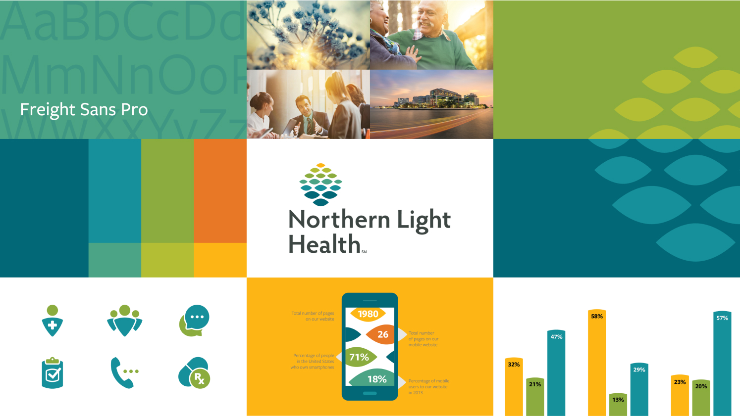
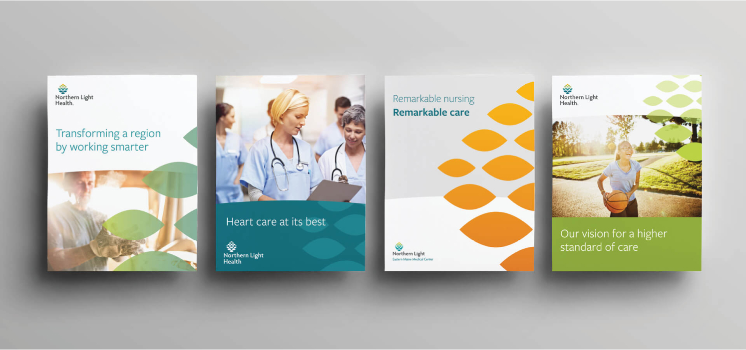
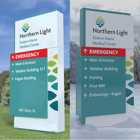
The visual identity system fully expresses this idea, with brand colors taken directly from the coastal and inland regions including warm tones of the day’s first light. The 16 facets in the brand’s logo nod to the state’s 16 counties, while also unifying digital, printed and physical touchpoints, including signage pylons that look gorgeous in both summer and winter.
A shared sense of purpose
But the core of Northern Light Health are the individuals who keep the system moving for their communities every day. The rebrand of EMHS to Northern Light Health is more than a name and a design system; it’s the dawn of a new day for health in Maine.
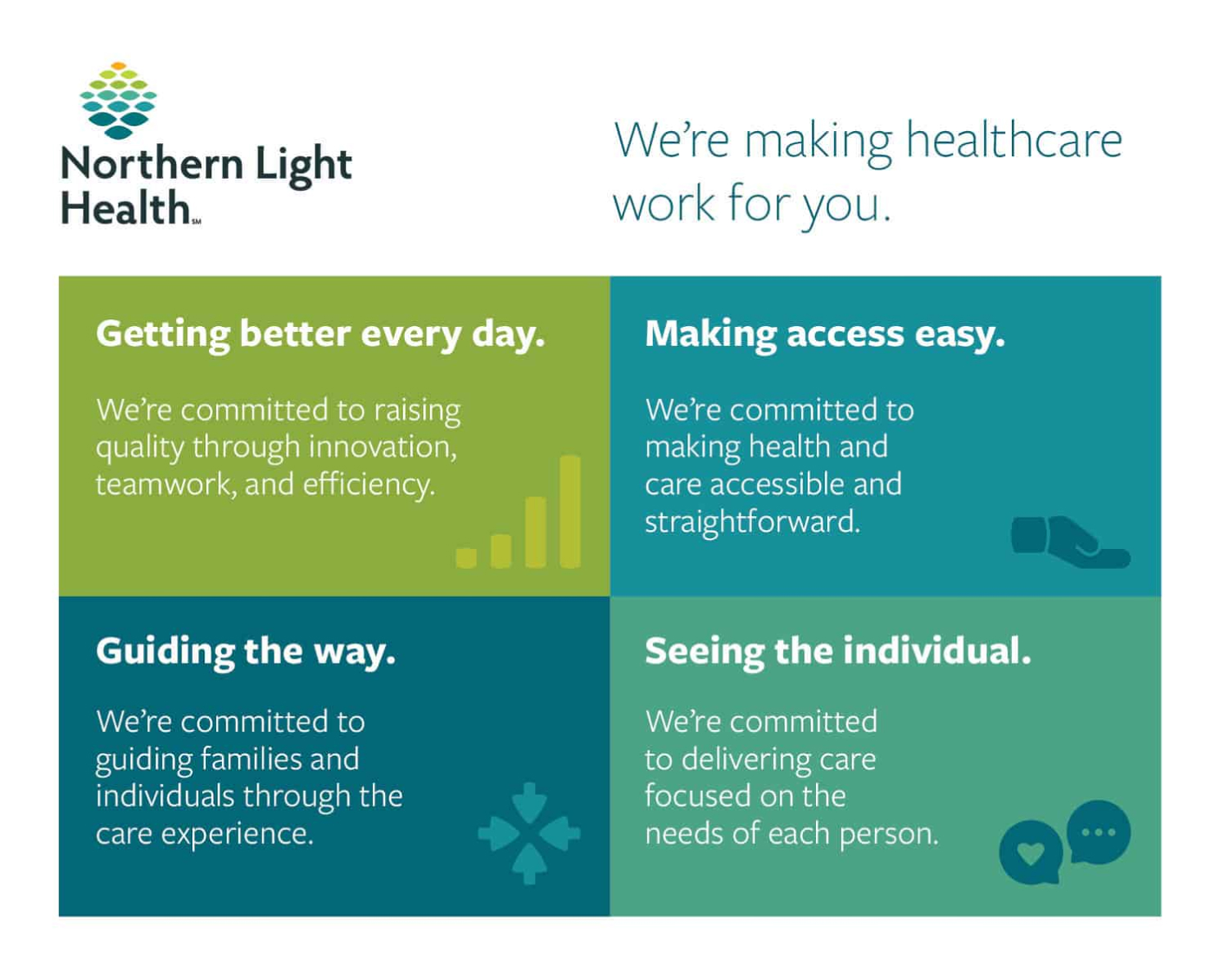
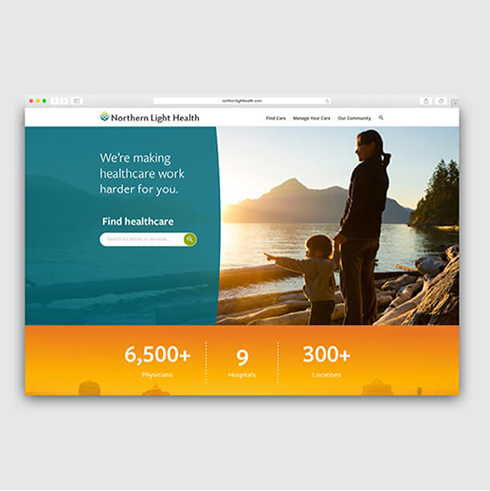
No matter when, where or how people engage with the system, Northern Light Health is dedicated to a singular promise: We make healthcare work for you. This spirit has always driven the organization but now serves as a rallying cry for more than 11,000 health care team members across the state. Northern Light Health is doing whatever it takes to make healthcare work harder, better and just the way patients need it.