Henry Ford Health
Relentless advocates of care
Challenge
When people think of Henry Ford, some think of the automotive factories, some think of innovation and some think of the strong presence he had in the Detroit community. One of the first things people in the Detroit region think of is Henry Ford Health. Since its inception in 1915, Henry Ford Health has an impressive history of firsts as well as a portfolio of innovative initiatives, but the brand wasn’t giving a full view into everything it was doing for the local community and the national scientific community. It was time to move away from Henry Ford the man and embrace the energetic, advocating spirit. It was time to enter the national stage with an updated identity that shed light and purpose on every initiative.
Brand strategy and promise
The work was led by a bold brand promise, crafted to reflect the humanity of the people and celebrate the spirit of the community: Your relentless advocate in making the impossible possible.
What does it mean to be an advocate who never gives up? It means modeling values. Having an inclusive spirit and welcoming all. Being a dynamic partner alongside patients and community members. And driving innovation, discovery and science forward. The new brand embodies the ambition of Henry Ford: From a traditional look and feel to a more progressive and modern identity. From a focus on compassion to compassion AND innovation. From being high touch to being high touch fueled by high tech. From a Detroit-centric story to a true destination brand, across the globe.
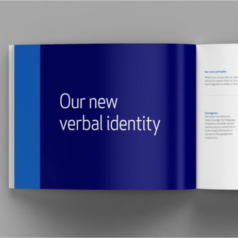
This strategy was also reflected in the brand voice principles that Monigle created with Henry Ford Health, which centered language that was courageous, dynamic, real and bright.
Your relentless advocate, making the impossible possible.
Name Strategy
There are two types of accessibility: one where people feel connected to you and you are approachable; and one where you are literally making people’s lives better by taking a more holistic approach to health. We were determined for Henry Ford Health to have both. Our goal was to simplify the experience to make it easier to connect with patients and communities.
One of the biggest signals of this commitment to simplification is to simplify the name by dropping “System.” Now the name emphasizes “health,” the calling Henry Ford Health is here to answer, and the outcome its patients seek. In addition, it moves the brand us away from being perceived as just a corporate entity, to feeling friendlier and more human.
Architecture
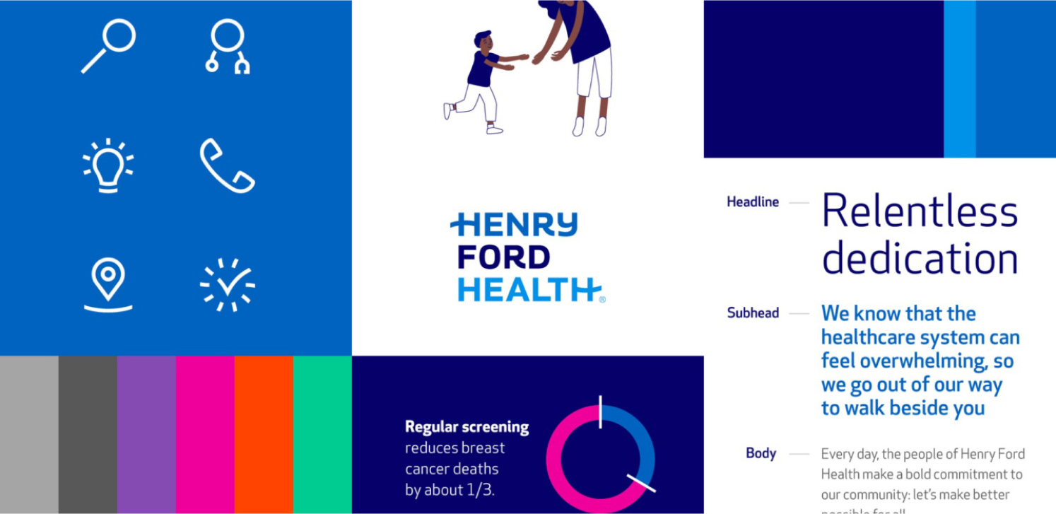
That meant creating a straightforward brand architecture — breaking down silos, modernizing the nomenclature approach and simplifying current ones. We leaned into a dominant masterbrand strategy, meaning there is one primary brand and one logo that to build equity into–a reflection of the brand’s unity and collective leadership. As we shifted the story from a focus on “what we have” to “why people should come,” we allowed for select service lines to be associated with the masterbrand logo: Cancer, Neurosciences, Heart & Vascular, Orthopedics, Transplant and Primary Health.
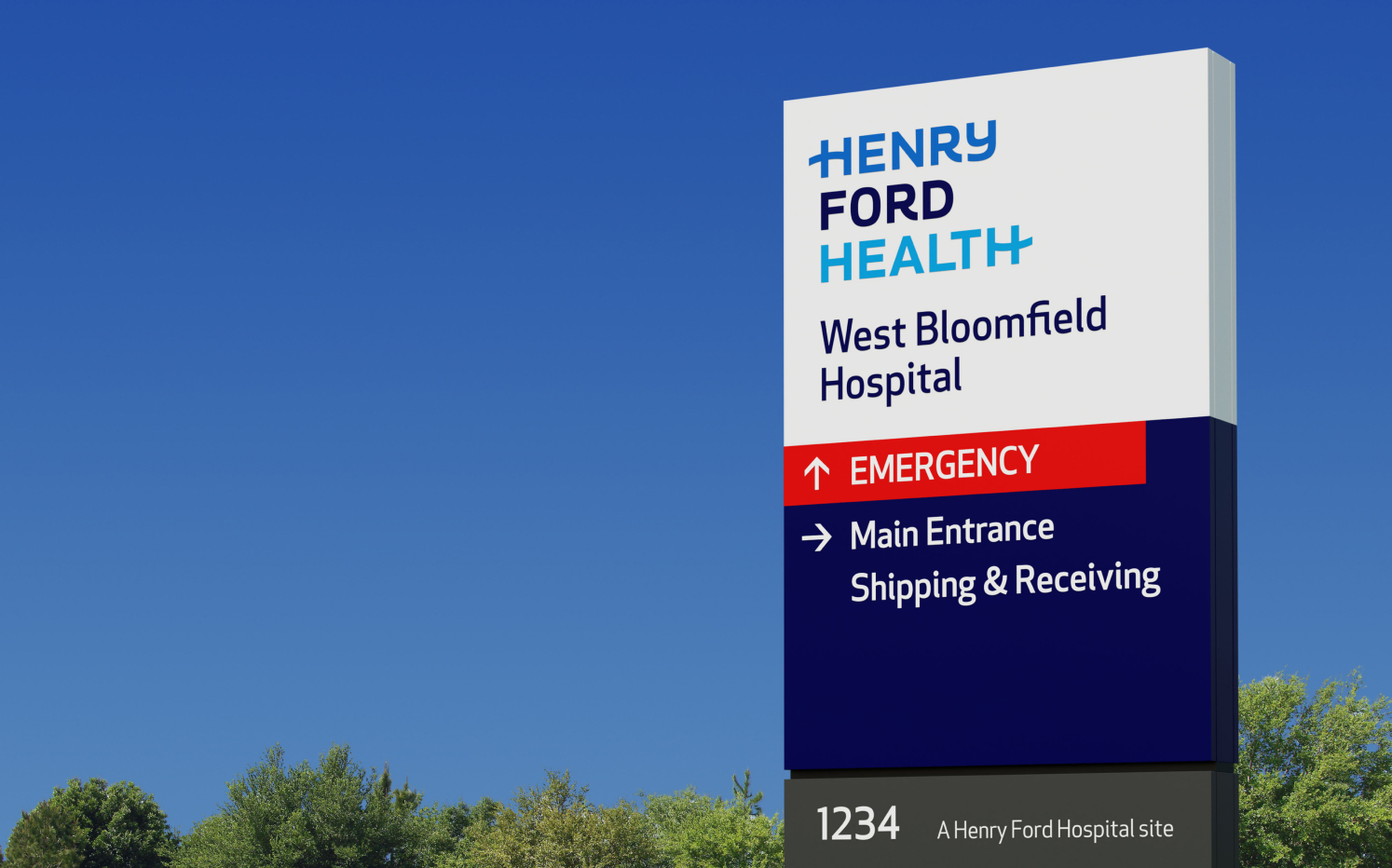
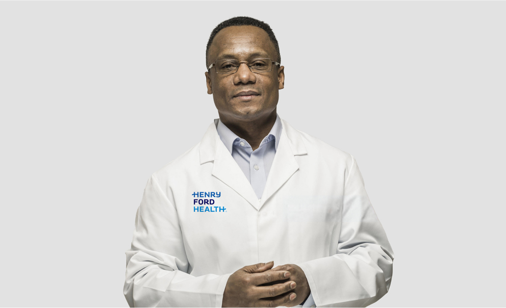
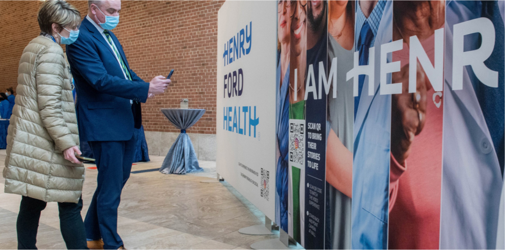
The logo
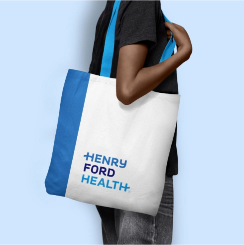
Inspired by legacy and the former logo featuring Henry Ford’s signature, we crafted a new signature that brings humanity to healthcare. The mark we leave is bold and balanced, approachable and clear. A clinical sophistication is achieved through all uppercase letters. The unique and distinctive script elements and visual ligatures are maintained to differentiate among the crowd. Three distinct blues honor the legacy color signal and can also be used to express diversity and innovation–creating a more distinctive and memorable logo.

The Results
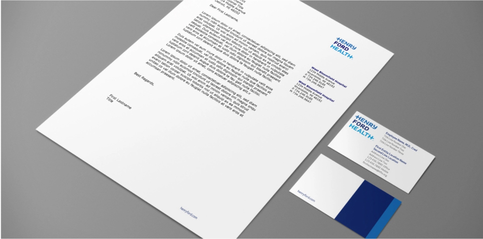
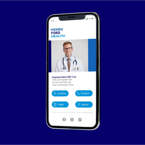
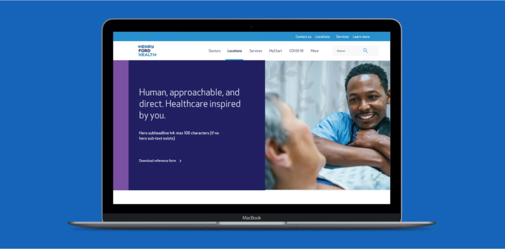
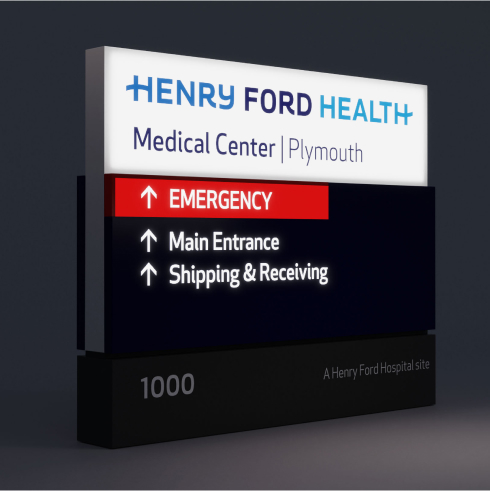
We equipped Henry Ford Health with tools for long-term success: brand guidelines, a detailed launch communications roadmap, brand training, branded templates and the right messages to deflect negativity. We enabled an effective implementation and launch with step-by-step guidance and drove the signage work to bring the brand to life.
The result is full buy-in for a simple, powerful brand that nods to the past and embraces the future
"The Monigle team has been a great partner and has been instrumental to getting us where we are."