The Timeless Clarity of Pictograms
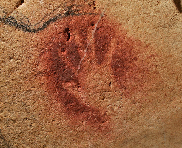
In 1994 three speleologists unearthed the entrance of an unknown cave in southern France. Named after one of its three discoverers, “Grotte Chauvet” contains around 1,000 drawings and carvings. Created 36,000 thousand years ago they represent the oldest collection of images known to mankind. One of them stands out and is particularly moving: a stencil of a hand.
Pictograms and influence on today’s brands
We can all identify with it and to this day we still connect with it. Why? It does not imply any gender or race or culture, but it does speak to our souls. The artist may have realized its universal appeal and decided to express it in the simplest possible way for everyone to recognize. In fact, we can almost feel the rock under our palm.
Throughout the ages, pictograms have evolved. They were used as the basis for the hieroglyphic language of the Egyptians and today, pictograms—or pictographs—are still used by non-literal cultures throughout Africa, the Americas, and Oceania.
1964 Olympic Games Pictograms
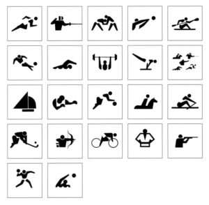
One of the more contemporary and recognizable uses of pictograms are the recurring ones used to identify the different sports at the Olympic Games. This tradition began in 1964 in Tokyo with the first, systematically designed set of pictograms for both sports and services designed by Masasa Katzumie and Yoshiro Yamashita.
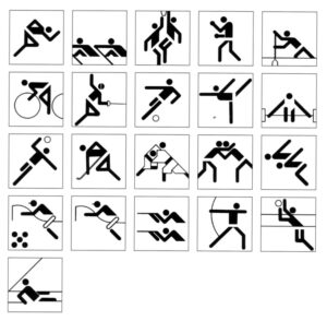
The pictograms designed by Otl Aicher and his team for the 1972 Munich Games raised the standard even higher and are considered the pinnacle of clarity and universality.
The success of the Olympic pictograms can be attributed to the following design aspects:
• First, identifying the key components of an image
• Then, defining a limited numbers of visual elements (shapes, lines, angles) that can be interpreted by anyone (again, no race, gender, or culture)
• Lastly, organizing these elements on a grid and using the repetition of elements and specific positions to convey meaning
1972 Olympic Games Pictograms
Aicher’s pictograms were so successful that Montreal decided to use them again for the 1976 Games. Los Angeles wanted to do the same in 1984, but found the licensing fee too high and chose instead to sponsor a competition to design its own set. It never received the same praise. The Munich icons were later complemented by the addition of new sports (notably for the Winter Games) and other non-sport specific subjects such as one symbolizing the idea of “athletics”.
Pictograms transcend language
There are several reasons for the use of pictograms in our society. A drawing transcends any language and can be understood universally. This is why one can identify signs for restrooms, emergency exits, or handicap access pretty much anywhere in the world, even if one doesn’t speak the local language or cannot read the local alphabet. Another reason is speed. Our society is increasingly impatient: we want information right away. Pictograms clearly and quickly convey messages to the reader.
A pictogram should use as little material as possible and be easily understood, it is an exercise in clarity. Through the use of only a few elements, pictograms must achieve a high level of identification—from wayfinding signage in airports to digital icons on smart phones. Some modern pictograms are quickly becoming “classics”: web-navigating icons for “Home” or “Menu” to mention but two examples.
How pictograms can simplify complex environments
I have recently noticed a revival of pictograms in brand identity. It seems a lot of organizations are developing their own sets, often by adapting existing ones with their corporate visual elements: colors, line weights, style, etc. This effort is largely due to the needs and demands of the digital world.
Many health care entities, both large and small, can benefit from applying pictograms as part of their brand identities. This is because health-related situations, such as experiencing a medical emergency or navigating complex spaces like hospitals to find a specific department, can be stressful to the patient or visitor. Pictograms can be applied to improve the user experience, break down language barriers, and convey precise information such as identifying the locations of departments. In addition, pictograms can help create a stable and reassuring environment.
They can also bring new solutions to brand architecture challenges. Wouldn’t it be wonderful if there was a common set of health care icons in use by the whole industry? Imagine one universal symbol for specialties like “Orthopedic”, for “Cardiac”, and even one to convey “Oncology”? And, it need not have to stop at “medical-only” pictograms. Both “After-Hour Clinics” and “Medicaid Accepted” pictograms have potential for use in numerous health care settings. The potential for utilizing a set of collective pictograms across all hospitals, clinics, and urgent care centers is incredible, resulting in an improved experience for patients, families, and employees.

Praxair Hand
Even though Grotte Chauvet was created 36,000 years ago, its impact lives on. Two weeks ago I downloaded the “2014 Annual Report” of Praxair, a US chemical company. The inside back cover featured a pictogram representing “Community Engagement”.
Look familiar? Whether or not it was done on purpose, we view it as a homage to an unknown artist of the distant past who unwittingly left a design legacy that has a permanent place in the modern fabric of today’s society.
Laurent Tschumy is a Creative Director at Monigle.
January 29, 2022 By
Related articles