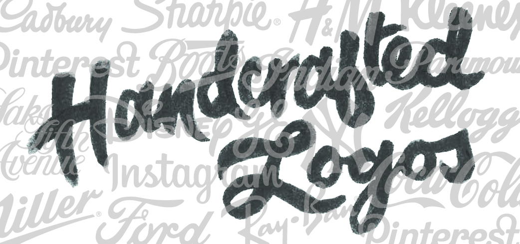
Handcrafted Logos

One of my first projects in my communication design major was to pick a typeface and trace it. Not just once or twice, but over and over again. When you finally got the hang of it, the task was to actually draw it. You think you know a typeface, until you’ve had to hand render it a few hundred times. That’s what the digital age of graphic design has taken away from designers.
My Mac in our office currently has 1,000 activated fonts, whereas it originally came with about 200 fonts standard. That in and of itself is both amazing and disheartening. It’s fantastic that I can access all of these tiny, intricate beauties in mere seconds with the tap of my keyboard. On the other hand, how will I ever make my Gotham logo look different from all the rest!? I’m not saying Gotham is overused; it is a beautiful modern typeface, with a specific time and place. Our friends over at Under Consideration, writers of the Brand New blog, also created a blog dedicated just to Gotham Logos. There you can sift through all sorts of logos created using the Gotham typeface. Gotham is so frequently used that if you were to look at the Saturday Night Live logo and the Cartoon Network logo you probably wouldn’t even notice they are using the same weight of Gotham!
So, what’s a designer to do in this new age of so many wonderful typefaces and clients who want to be original? We go back to the basics. We go back to our first design project in art school — we draw it ourselves. It might be hard to remember, but there was a time when Apple‘s Font Book didn’t exist. When designers had to transfer or set type by hand, letter by letter. It’s like that scene in Garden State:
Sometimes you’ve got to do something totally original in a way that no one ever has before. Hand rendering a word is just like that. A logotype that’s drawn by hand is unique and can never be duplicated by my 1,000 activated fonts.
Examples of Handcrafted Logos
An illustrative logotype speaks for itself. It has a personality so unique that you want to be its friend. We already associate ourselves daily with major brands that use hand rendered logotypes like Coca Cola, Coors, and Ray Ban. Both Kleenex and Puffs have logos that look so handwritten that your mother could have jotted them down on a grocery list alongside Campbell‘s soup and 7up to nurse you back to health. The Disney logo is the epitome of magic. The Macy’s logo says, “I’m modern and corporate and you can find me in every major US city.” While the Saks Fifth Avenue logo says, “I’m sophisticated and unique, best fitted for the Upper East Side.” And you don’t have to be a baseball fan to want to wear a New York Yankees hat with that iconic “NY” mash-up.
To simply put it, designers and clients alike want a Walden experience when it comes to typography. That is, we want our words to be self reliant, independent, free thinkers. To get to the heart of what that word means and really bring it to life in a way that nothing else has done before. We want our logos, book covers, album covers, billboards and posters to have soul. To stand out amongst the Helveticas and Gothams that consume our graphic landscape. To have a totally original moment in a seemingly unoriginal world. And so we draw.
September 11, 2013 By Vanessa Wainwright
Related articles
From identification to experience: The brand expression building blocks

From wayfinding to brand building: The changing role of signage
