Brands and Signs, Part Two: Color, Lighting, Format
When bringing a brand to life, agencies and clients have a shared responsibility to develop a system that communicates to the customer on all levels. Enterprise Rent-A-Car, GE, and Bank of America are three great examples of brands which have fully developed sign programs that communicate clearly at every location.
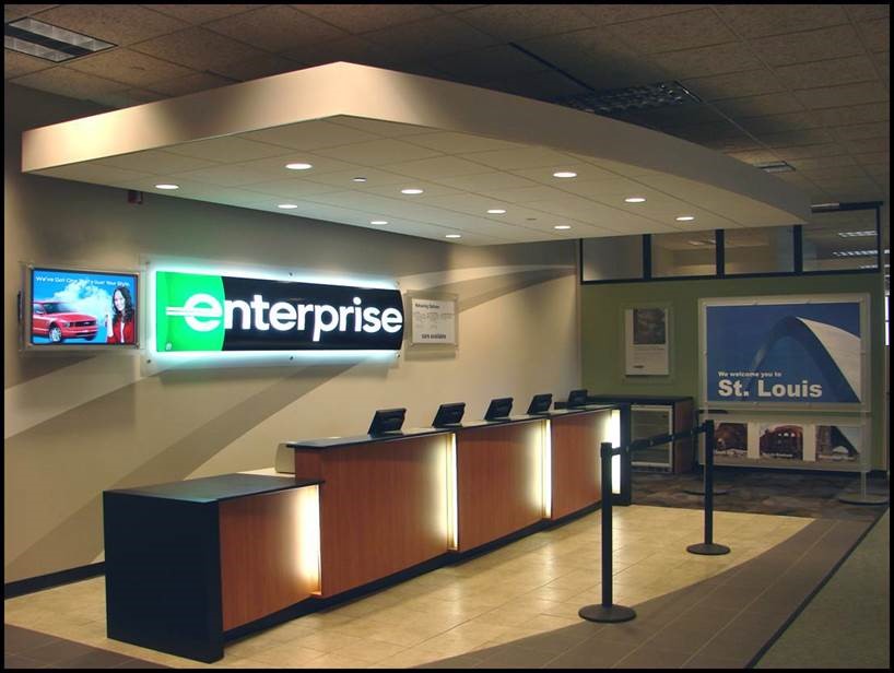
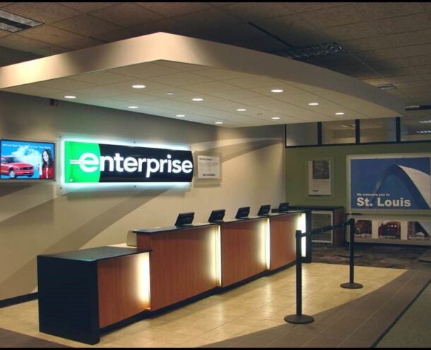
Enterprise Rent-A-Car has a brand system that translates easily to a wide variety of architectural applications, illuminates well, and communicates for both interior and exterior applications.
Take Enterprise for instance―when you visit any of its locations anywhere in the United States, the brand’s signs are consistent, easily identified, and helpful to you as a consumer. This is because the brand structure is simple and concise with latitude to account for the specifics of the brand’s signature, color, lighting, and typographic needs. This is what every brand should strive for in a sign program. But, just how is this accomplished?
Signature Color and Format Work Together:
In a perfect world, a full color signature is ideal, but sometimes full color does not always work. When applying a signature on a light color or white background and internally illuminating the face at night, the signature elements become narrow in appearance and darker colors shift to black. In simple terms, this occurs as the stronger background light spills over the edge of the graphic characters. This can be corrected by creating custom sign signatures where the stroke weight and character spacing is adjusted to accommodate for this phenomenon. The compromise is that you will most likely get an acceptable solution, but there will be a visual variance from the preferred brand presentation during both day and night conditions.
Lighting Can Be Challenging:
Illumination always adds a level of complexity to maintaining consistency in any sign program, which is attributed to several reasons. Some colors have a tendency to vibrate against a dark background or when coupled with other color combinations. When lighting certain colors, due to the materials used in the sign decoration, colors can also tend to shift making it difficult to get a consistent day and night read of a brand’s colors. And, some colors, such as blue, gray, and purple, are difficult to pump light through, which creates a dim appearance. Illumination makes working with color in signs much more difficult than just picking a Pantone color.
The best solution is to use an all-white reverse signature in any branded sign system. The result will be a powerful and consistent nighttime read, and it is an application that works well on the branded sign architecture as well as on any landlord restricted tenant signage.
Use Support Typography for Better Understanding:
Sign systems will inevitably require support type for wayfinding and facility function copy. Support type should be of a heavier or medium to bold weight for better readability at smaller copy sizes. Eliminate serif fonts when possible; serifs are difficult to work with in signage. On routed and illuminated faces, tool sizes can alter the appearance of a serif font due to the physical limitations of cutting bits. When illuminating individual letters, it is more difficult to position lighting elements inside of the sign body and spill light into the corners of a narrow serif―the result often times is shadowing or dark tips on the letters.
Design systems also need to consider the Americans with Disabilities Act (ADA) compliant typefaces meeting the stroke width to height ratio requirements. The family of support type will also need to have a san-serif option that meets the ADA requirements for copy. These considerations are very important if your brand finds itself extending into an interior branded sign system.
When designing a complete brand system, specific considerations need to be made for signage. Signature, color, and typography elements are critical to the success of any branded sign program.
Read Part One to learn what you need to know before you begin your brands and signs program.
Want to know more about wayfinding and signage? Visit our Environmental Branding page.
John Dohner is a Program Director on Monigle’s Branded Environments team.

December 10, 2014 By John Dohner
Related articles
From identification to experience: The brand expression building blocks

From wayfinding to brand building: The changing role of signage
